By Mina Reyes
Given the task of designing a new logo that represented Muaythai Ontario sounded like a lot of fun at first, but it ended up being an incredible challenge. This one stumped me.
How do I find a uniqueness to something that almost every gym, every organization have? It seemed like the majority of muaythai logos had either a Wai, or a knee or a bow or a flying punch or a kick. I wanted the new logo to break free from that mold. It had to be simple, yet, dynamic, convey a lot of energy, movement, power. It needed to be something that stood out on its own.
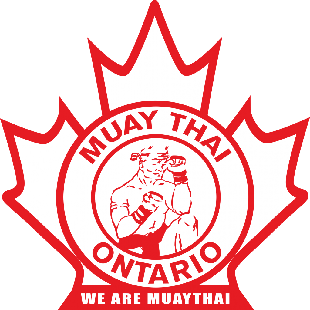
But after all was said and done, tried and tried again, I ended up with several concepts with a knee, a kick, a wai – because, at the end of the day, that’s what muaythai is, its the science of eight limbs. It is a knee, an elbow, a kick, punch, a wai kru, a ram muay.
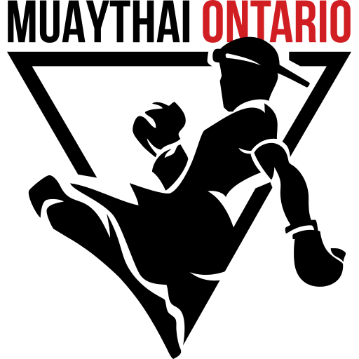
I did some research on Ontario. “Ontario” was derived from Ontarí:io, a Huron (Wyandot) word meaning “great lake”, or possibly skanadario, which means “beautiful water” in the Iroquoian languages1. Hence the inverted triangle, the elemental symbol of water, thus symbolizing Muaythai Ontario’s constant state of motion – always moving forward, ever changing, ever adapting.
So, after a year of creative blocks, procrastination, thousands of doodles, endless reading of magazines/articles on logo trends, countless hours scouring the internet for inspiration, including dance logos, team logos, Native American art, tattoos and simply just asking around for people’s opinions, this is the new logo. I hope you like it as much as I do.
1https://en.wikipedia.org/wiki/Ontario
Mina Reyes is a part-time instructor, full time designer. Mina has been Muaythai Ontario & Muaythai Canada’s primary designer since 2016, and you can find more of her work at www.minareyesdesigns.com.

